 MedME
MedME
 MedME
MedMEHelping doctors
digitalize their
practice
Doctor-patient managment app
Project Overview
Background
MedMe is an appointment booking platform that allows us to book an appointment for Doctors from the ease of our home.It also helps Doctors to manage appointments and save their time.
Why Medme?
Time is scarce resource because you cannot get is back; saving everyone’s time and avoiding standing in line with sick individuals will prevent the wastage of the most valuable resource of all-time. Anyone can easily arrange an appointment with this app’s assistance. Find the best physician by specialty and location. View the physician’s available times and click to book an appointment right away.
WHAT WE DID
Design Process
We completed 5 design steps to make the design more effecient and user-friendly. We started with searching problems user may face snd defining solution concepts, creating user interface design and creating a user centric creative prototype.

VALIDATION
Problem Statement
To current scenario we face several problems when making an appointment and stood in line indefintely which sounds unsafe after Covid-19 breakdown. To tackle this we need an advance online doctor consultancy & communication mobile app that has a smooth & easy experience for users.
Target Audience
The target audience is patients, current or potential, who need to find a doctor and make an appointment quickly, conveniently, and securely. Also, local doctor’s who find using an app convenient to manage their appointment and prescriptions.
Goals
This app will help anyone to book an appointment instantly. Patients can search for the right doctor by speciality, symptoms, location, check doctor’s available time slots and book instantly avoiding the need to wait in longer queues, making it easier and faster to reach doctors. They can also avail text checkups and online video consultation. Doctors can also manage their appointments and save time.
Solution
To develop a CRM system that includes mobile app for patients and doctors to make a better online medical consultations. This CRM system will help patients and doctors organize productive communication by optmizing time, cost and improving communication

Research
User Interview
User research focuses on understanding user behaviors, needs and motivations through observation techniques, task analysis, and other feedback methodologies. And this lead us to know that
75%
Most people prefer private healthcare services over govt hospitals
80%
People wants instant consulting services that includes voice call/ video call/ chat etc.
65%
People visit the doctor only when sick. The rest visits one or few times a year
70%
People searched for doctors on internet but failed to contact due to lack of information.
95%
People would agree to pay through a mobile app to get an instant doctor’s consultation.
50%
People tried to use an app but found it difficult to use due to its interface.
User Pain Points
During our research we concluded most of our users have samiliar behaviours and pain points. Organizing them helped me narrow down my vision for pain points, from which we can create a list of features for an app that is more user centric.
Uncertainity
People should know about the doctor and in advance about their experience, educational qalifications, reviews etc. to make an opinion on communication.
Records
People often misplaces records,documents or medical bill and keeping track to this records is a tideous task.
Nervous
People tends to be nervous waiting for their turn for a long time. In addition to pandemic situation people find it unsafe.
Feasible
It will be an easy if you can get connected to doctor within a short period and get recommendations/cure for your problem and don’t hesitate to ask what to feel.


User Personal
Creating personas help you understand who are the potential users, what are their goals and fustrations and for what purpose they will use the product.

More Information
Age: 47
Status: Married
Education: Management
Location: Canada
Background
Christina is a Managing director at a reputed company in India. Previously, she visited a doctor in a public hospital with her parents. Due to the high rush and more waiting time, she found it terrifying to stay there for so long as she could risk her and her parent’s life with the current scenario of the pandemic. She would prefer to book an appointment beforehand and visit at a schedule, or she can take a consultation online.
Goals
 To have a safe and helathy living.
Store information at one place. Have better communication with the doctor.
To have a safe and helathy living.
Store information at one place. Have better communication with the doctor.
Fustrations
Being Infected by COVID-19.
Loss of data by medical personnel.
Dont really know about doctors experience.

More Information
Age: 32
Status: Married
Education: Masters in Arts
Location: Canada
Background
Victor is Java Developer at a reputed IT Company. He is married and has one child; he and his family spend most of their time together. Due to sedentary work, Victor often experiences back pain, so he has to visit a doctor. Unfortunately, he does not do this often as he cannot make an appointment suitable to his time, and standing in a queue waiting for the doctor is not recommended by him.
Goals
To be health and fit.
Want best treatment for his family.
Dont miss appointments and follow ups.
Fustrations
No time to stand in queue to see doctor.
Skip follows-ups without reasons.
Lose all test results.
Discover
After conducting interviews, compling user personas, defining target users, analysing the responses, we discovered insights that helped me determine what features should be considered while designing a mobile app.


USER FLOW
Navigation Diagram
Navigation structure diagrams are used in the design stage to provide an overview of how the entire system will link together and how the user is expected to navigate between different interfaces.

WIREFRAMES
Low Fidelity Wireframes
Low-fidelity wireframes are basic wireframes that outline blueprints for web pages or app screens. They help you communicate your product’s “big idea” rather than the specific details.

Style Guide
Design Guidelines
Visual style is an essential part of project as it help standardize system of colour, fonts, button, text input and many more components combined to form a visual screens.
Blue is a theme color due to its feasible nature of giving a sense of security and building trust, and often blue is associated with depth and stability.

Fonts

High fidelity screens
Final Design
A high-fidelity wireframe captures the look and feels of the product in the advanced stages of the design process. Hi-fi wireframes include actual content, typefaces, colors, image dimensions, and branding elements.
Onboarding Screens
Splash Screen

Onboarding – 1

Onboarding – 2

Onboarding – 3

Sign-In

Sign-Up

Home and Search
MedME got an advanced Search screen where you can find categories of search such as finding doctors, pharmacies, vaccination centers, hospitals, and many more, making the app more user-friendly and user-centric.
Search

Home screen

The app provides a user-friendly dashboard with categories listed for easy search of users and watching their history of visits so they are updated.
The home screen also provides tabs such as Nearby Doctors, Hospitals, Pharmacy, etc., for a good user experience.
Introducing App Assistant and messaging
app Assistant

Chats

Calls

The Homescreen provides an App assistant for users, who can directly chat through and get solutions to their problems in case of finding doctors, pharmacies, quick checks, etc.
Messaging your doctor online can’t get easier than this. Ask questions, send files, keep track, and what more is essential.
Book An Medicine
After Checkup, the prescriptions are approved by the doctor. The user can get medicine delivered by buying it online on the app and paying for it
Search

Find pharmacy

Add medicine to cart

Book An Appointment
Find Doctor

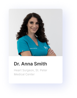
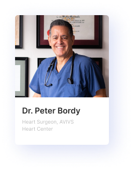
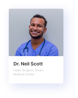
Doctor BIo
")
After Choosing Find Doctor on the Search screen, the app provides you with a list of specialists in their field with reviews. To add more user-centric touch, we have given a search bar with a filter search so that the user can find a perfect match for the problem.
As soon as you select the doctor, it provides you with a bio, so you know about his experience, the client dealt with, the location for treatment, reviews, ratings, etc., to get convinced for the appointment.
Book An Appointment
After booking an appointment, it redirects you to the Appointment screen, where you can choose between dates, time slots, and appointment types.
This leads to filling in details of patients and what problems they are facing as an initial idea.
After the process, you can choose between the mode of payment and pay online and get your appointment fixed.
Appointment Details

Book Appointment

Other Screens
Notification

Profile

Get Notified with new notifications, reminders, and messages so that you don’t miss out on anything and stay updated with your appointments, test results, etc.
While the profile screens enable you to keep track of appointment details, test results, prescriptions, payments, and privacy.
Your Technology Partner
We bring the power of technology and advantages to your digital transformation.
Contact us to learn how we can help.